Type Studies
Looking for a letter’s balance, one curve at a time.
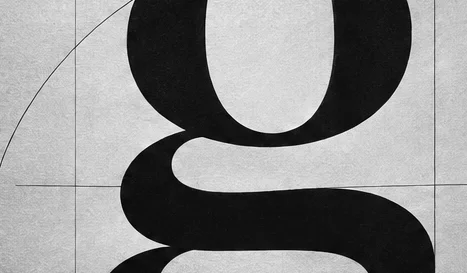
I enlarged a lowercase g and traced the counter, link and lower loop. Each curve looked right in isolation. Put together, the letter leaned to one side.
At text size the heavy turn was easier to spot. The final adjustment was tiny. I kept both sketches so I could see the difference.